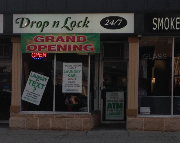
The Job: Provide point of purchase signage, explaining a new business’ services to passersby immediately prior to its Grand Opening.
The Client: Drop N Lock, Laurie Erb, Proprietor
Drop N Lock provides customers access to a dropoff and pickup point for their laundry and dry cleaning. Using a credit card and a code provided by the vendor to gain access to the unstaffed facility at any time of the day or night, customers place their laundry in individual, lockers for processing and pickup. Drop N Lock notifies customers by text when their laundry has been completed, and they can retrieve it at their convenience.
Challenge #1: The name, “Drop N Lock”, while literally descriptive of the process, does not define the service clearly, and, even assuming that passersby would pay attention to such a lengthy description, its complexity makes the service sound less efficient and convenient than it actually is.
Challenge #2: Traditional 24 hour laundromats are staffed, and access to them does not require swiping a card to pass through the front door. A potential customer, mistaking Drop N Lock for an unstaffed laundromat or one with a door that appears to be locked might conclude, erroneously, that Drop N Lock is closed, run improperly, or experiencing difficulties of some kind in which he’d rather not get involved. He leaves forever, looking elsewhere for service that may actually be less suitable to his needs than Drop N Lock’s but has the virtue of being familiar. So, how to make the laundry service of the future seem like an old pal?
Everything New is Old Again:
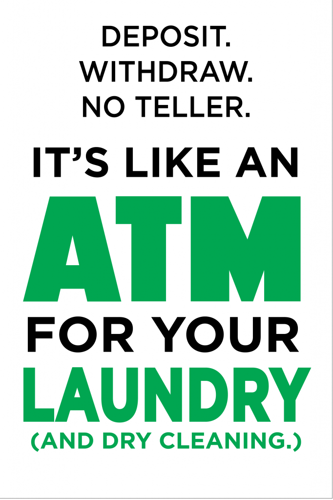
During our initial conversation regarding the Grand Opening, Laurie had likened the card-activated access to entering an automatic teller’s vestibule, a convenient, non-threatening, everyday experience with which most potential customers are already familiar, even if they have not, hitherto, associated it with laundry. I ran with it.
The somewhat cryptically-named “DROP N LOCK” became “AN ATM FOR YOUR LAUNDRY. reassuring the customer that not only is this a familiar scenario, it’s business as usual. No staff? No problem! We’ve swiped our cards to open doors; we’ve made deposits. We’ve made withdrawals. (Even the obvious money-laundering joke, while potentially pejorative, is, at least , familiar…)
Phoning it in
Never miss an opportunity to involve your customers’ wireless lifeline.

DROP N LOCK Brand Design 2. 2014 by Steve Price
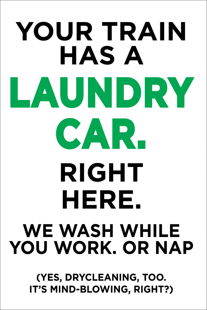
Play to Your Strengths: Basic TRAIN-ing
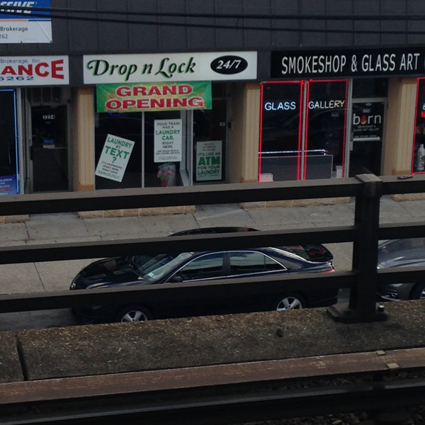
Since Drop N’Lock faces a very busy railway station, it is fortunate enough to have a temporarily captive audience of potential customers milling about the platform, arriving and departing in waves all day and night -which just happen to be Drop N Lock’s hours of service.
All three sales arguments are visible from the platform. I’m told that the Grand Opening was a huge success.
If you like what you see here, and you’d like to Put a PRICE on your business, please use the contact page above.


