Client: Adam McGovern, INDIE INK STUDIOS
Challenge: Develop a Logo for a New Comic Book Series with a Retro Feel
“Lo, There Shall Be a Logo…”
I’ve probably spent the largest part of my career making signs and point-of-purchase advertising, but I’ve always been fascinated by comic book logos. Some of them, like the perspective-defying arc that graces Superman’s signature title, remain relatively unchanged for decades, while others morph with every new reboot and typesetting trend. So, when old pal and rising comic book scribe Adam McGovern approached me regarding the development of a logo for his comic book series, NIGHTWORLD™, an operatic mashup of the superhero comics of Jack Kirby and the horror movies of Mario Bava, as imagined by Adam and co-creator Paolo Leandri, I welcomed the challenge of adding to the lengthy legacy of logos. While not a tutorial by any means, this is a brief description of the process by which we arrived at the final version of the logo which appears on the cover of each issue of the Image Comics NIGHTWORLD™ series:
“Halloween is Every Day…”
Comics are, essentially, a synthesis of words and images, so there’s no reason why a comic book’s logo can’t draw from both wells. As the protagonist of NIGHTWORLD™ was to be a soul-searching demon, an occult feel was imperative, and nothing else says “occult” quite as succinctly as a pentagram does:
Not a bad first effort, and I forget if it had yet been decided whether the name was to be one word or two, but there was already a perfect pentagram parking place within the name, NIGHTWORLD™ itself. Hence:
I liked this one, but it wasn’t very modern, and that font has become synonymous with Halloween signage in my neck of the woods. Onward and up, up, upward…
“The hero that NIGHTWORLD deserves…”
I didn’t have access to many horror comics as a child; but superhero logos were everywhere. Their influence is shown in this version.
Undeath Metal
I upped the netherworldly graphic elements on this next take, but it still had too much of an action-movie/rock band esthetic (I had, after all, been a T-shirt artist for the Ramones in the 1990’s) and not enough gothic horror in its DNA.

As per Adam’s suggestion, I began researching Hammer Horror movie posters and old Charlton horror comics. It became clear that my collection of fonts was bereft of a typeface eerie enough to serve as a launch pad for a logo that would convey the proper mood for NIGHTWORLD™. I skipped over to the Blambot site and found several likely candidates.
“And I would have gotten away with it…”
This version was developed from Monsterific but, in the end, proved to be a little too Scooby for our needs.
“Bring on the Night(world)…”
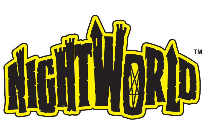
We found our font in Nate Piekos’ appropriately-named Scream Queen With the addition of a couple of parapets and a solitary tower window, along with some input from Image Comics’ Publisher Erik Larsen, the finalized logo took shape.
  NIGHTWORLD™, by co-creators Paolo Leandri and Adam McGovern, with colors by Dominic Regan and design/packaging by Lynn Brunskill and Steve Price, is available from Image Comics in print and digital formats and also as a digital download from Comixology.com
My love affair with the Scream Queen font is documented in the slightly more dramatic essay “I Was A Middle-Aged Scream Queen Fan” on Joshua Glenn’s HiLowbrow.com
If you like what you see here, and you’d like to Put a PRICE on your logo, please use the contact page above.
If you’d like to learn more about comic book logos and lettering, there’s no better place to start than comic lettering superstar Todd Klein’s blog.
…And this just in. Dom Regan’s People Protector AKAY is now available as a digital download from Comixology.


